April 29, 2026
Channel letters are a popular and effective form of signage that can help businesses attract and direct customers. These three-dimensional graphic elements have become an essential fixture for brands looking to make a visible impact. To maximize their effectiveness, creative design strategies need to be employed. Understanding the intricacies of channel letters can significantly enhance their allure and boost foot traffic. This article will explore various innovative approaches to make channel letters more eye-catching and memorable, ensuring businesses stand out in a competitive market.
Channel letters continue to play a key role in commercial signage due to their visibility, lighting flexibility, and adaptability across different storefront environments. According to Future Market Insights, the global signage industry was valued at $36.7 billion in 2024. These factors contribute to their widespread use across retail and service-based businesses seeking stronger brand presence. Thoughtful design choices in materials, lighting, and color help maximize their overall impact in competitive spaces.
1. Innovative Material Selection
Use Reflective Materials
All in all, reflective materials in channel letters can greatly enhance visibility, especially in low-light conditions, making businesses more noticeable even at night. These materials work by reflecting light from natural sources, such as streetlights or car headlights, ensuring that the signage is never obscured by darkness. This technique is particularly beneficial in urban environments where lighting can be sporadic. Adopting reflective surfaces not only improves functionality but also adds a modern aesthetic to the signage. Channel letters benefit from this approach because visibility remains strong across varying lighting conditions.
Reflective materials offer an added advantage by reducing the need for artificial lighting, helping signage remain visible with minimal energy input. They also create subtle visual variation during the day as natural light shifts across the surface. This combination of practicality and visual appeal makes reflective finishes a useful option for businesses that rely on strong visibility at all hours.
Apply Textured Surfaces
Introducing texture to channel letters is an effective way to add depth and interest to signage, making them stand out from flat, plain designs. Textured surfaces create visual contrast by interacting with light and shadow, turning simple signage into more dynamic focal points. Materials such as brushed metal or embossed finishes are commonly used to achieve this effect. Channel letters with texture offer a more layered visual experience for viewers.
Texture can also help reinforce brand personality by adding subtle visual cues that feel more tactile and dimensional. Whether smooth, brushed, or patterned, these finishes contribute to a more engaging and visually layered sign that captures attention from multiple angles. Channel letters designed with texture can communicate more character without overwhelming the overall design.
Select Standard Commercial Sign Materials
Channel letters are most effective when built using proven commercial-grade materials such as aluminum, acrylic, and vinyl components commonly used in professional signage fabrication. These materials allow for durability, clean finishes, and long-term outdoor performance. Channel letters constructed with these materials maintain structural integrity across different environments.
Each material choice plays a role in how the finished sign looks and functions, especially when paired with internal illumination systems. By focusing on dependable fabrication materials, businesses ensure their signage maintains a consistent appearance in a wide range of environmental conditions. Channel letters benefit from this consistency in both durability and visual output.
Build Durable Fabrication Choices
With channel letters, material selection is guided by durability, visibility, and structural integrity. Professional signage typically uses industry-standard components designed to withstand outdoor exposure, including weather-resistant metals and acrylic elements. Channel letters built this way are designed for long-term performance.
Choosing well-built materials ensures the sign remains readable, structurally sound, and visually consistent over time. This approach prioritizes performance and longevity, helping maintain a professional appearance in changing conditions. Channel letters benefit from reduced maintenance needs when properly constructed.
Choose Acrylic-Faced Lettering Options
Channel letters often incorporate acrylic faces that allow light to pass through evenly, creating a clean and professional illuminated effect. These materials are commonly used in signage construction to achieve consistent brightness and strong visual definition. Channel letters using acrylic faces achieve balanced illumination.
When paired with internal lighting systems, acrylic-faced letters provide a polished appearance that enhances readability and storefront visibility. This makes them a widely used option in commercial signage design. Channel letters benefit from this combination of clarity and illumination.
2. Applying Lighting Techniques
Integrate LED Backlighting
Overall, LED backlighting has become a core element in modern channel letters due to its brightness and efficient performance. It enhances visibility both day and night, ensuring signage remains clear and readable in a variety of lighting conditions. Channel letters using LED systems maintain a strong visual impact.
LED systems can be integrated within channel letters to create even illumination and strong contrast, helping businesses improve storefront visibility and overall brand recognition. Their low maintenance and long lifespan also make them a practical choice for commercial signage. Channel letters benefit from consistent lighting performance over time.
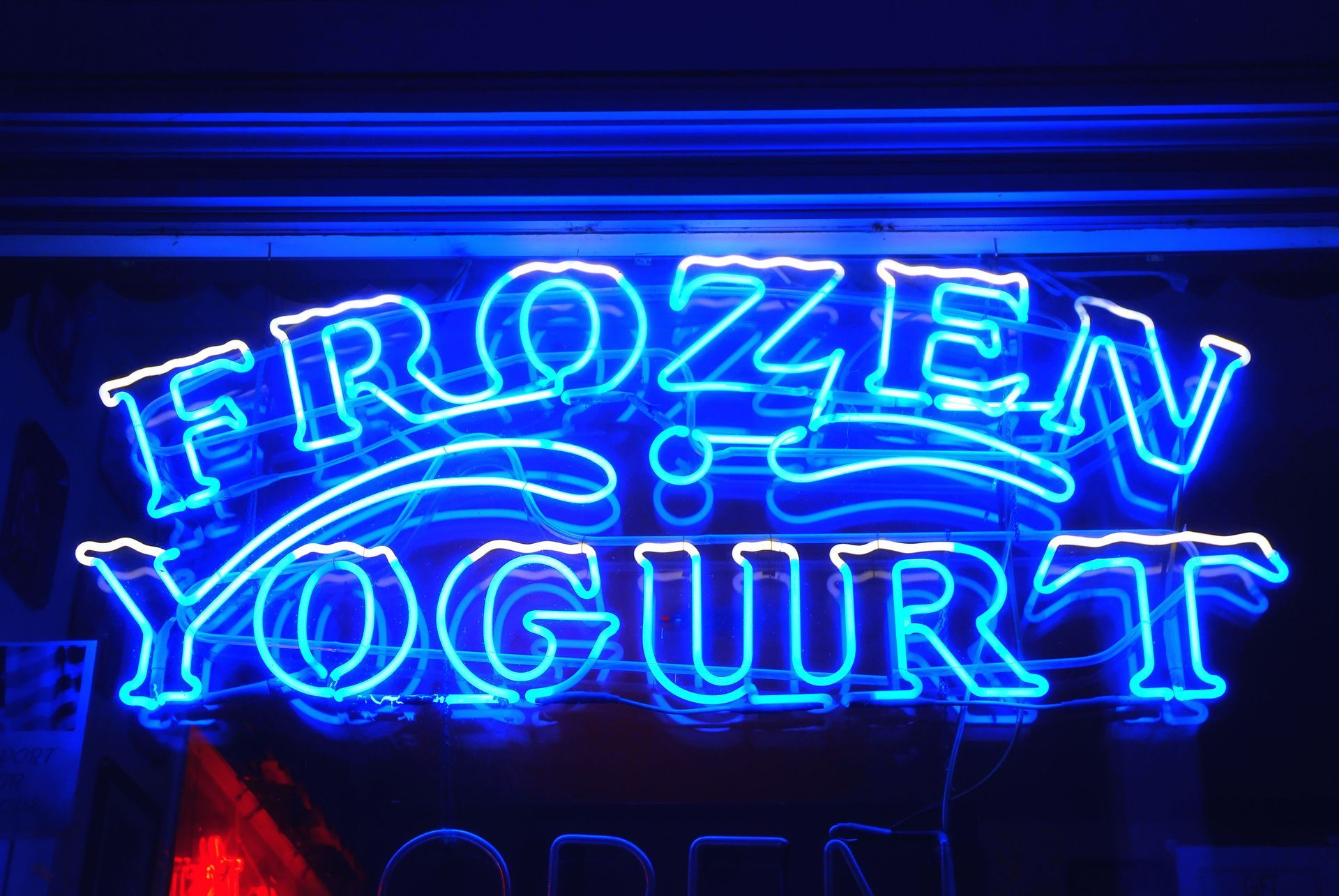
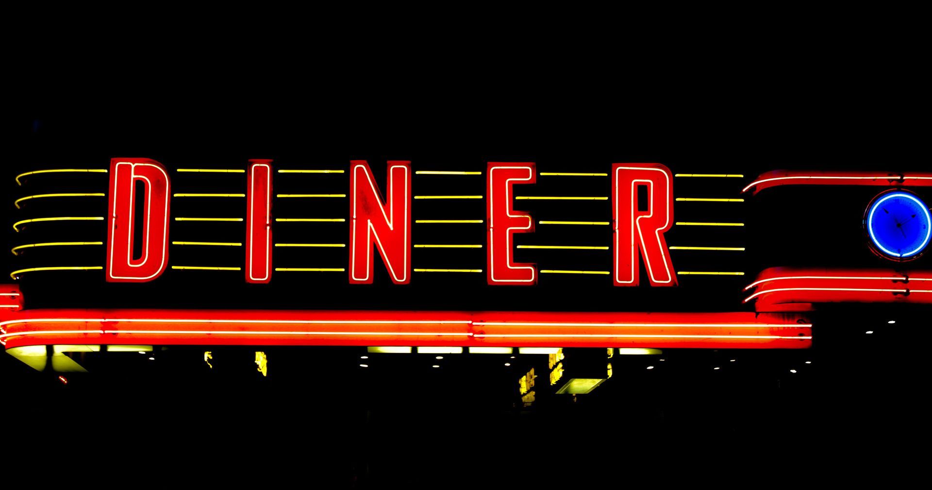
Incorporate Neon Illumination
Neon-style illumination continues to be a recognizable and visually striking option in signage design. It creates a bold glow that naturally draws attention, making it especially effective in high-traffic or nightlife-oriented environments. Channel letters using neon-style lighting achieve a strong visual presence.
Modern versions often use LED-based neon alternatives, which replicate the look of traditional neon while offering improved durability and energy efficiency. This allows for vibrant lighting effects without the fragility of glass tubing. Channel letters benefit from safer and more durable illumination options.
Combine Internal and External Lighting
The choice between internal and external lighting plays a major role in how channel letters are perceived. Internal lighting places illumination inside each letter, creating an even and consistent glow that improves readability. Channel letters using internal lighting maintain clarity.
External lighting uses spotlights or mounted fixtures to highlight signage from the outside. This method can add depth and contrast, especially when used to emphasize architectural features or storefront details. Channel letters can benefit from layered lighting approaches.
Implement LED Lighting Systems
LED lighting is a key component in channel letter signage because of its efficient performance and consistent output. It provides strong illumination that ensures signs remain visible in both daytime and nighttime settings. Channel letters rely on LED systems for strong performance.
LED systems are commonly used inside channel letters to create smooth, even lighting across each character. This enhances readability and helps strengthen brand presence in commercial environments. Channel letters benefit from uniform illumination.
Position Lighting Strategically
Proper lighting placement is essential for maximizing the effectiveness of channel letters. Internal illumination is typically used to ensure each letter is evenly lit and easy to read from a distance. Channel letters require careful lighting alignment.
3. Enhancing Color and Branding Synergy
Apply Color Psychology Principles
Understanding the psychology of colors is important for creating channel letters that communicate brand identity effectively. Different colors evoke different emotional responses and can influence how a business is perceived. Channel letters use color to strengthen recognition.
For example, blue is often associated with stability, while red can create a sense of energy or urgency. Selecting the right color combinations helps reinforce branding and improve recognition among customers. Channel letters rely on color choice to support visual identity.
This type of signage continues to be a highly effective choice for commercial applications thanks to its strong visibility, flexible design options, and lighting capabilities that help elevate storefront presence. When materials, illumination techniques, and color selection are thoughtfully combined, businesses can create signage that is both clear and visually impactful in competitive environments. To explore custom solutions and see what is possible for your brand, learn more with Houston Sign Maker, where design, fabrication, installation, and repair services are tailored to meet a wide range of commercial signage needs.